What Are Frozen Summary Rows?
Most grids in Standard Time® can pin one or more special rows above the normal data — a row that stays fixed in place while everything below it scrolls. Two of the plainest are Totals at Top and Totals at Bottom, which just sum whatever numeric columns are currently visible. This page covers eight different, much richer special rows: Gantt Mini-Map, Mini WIP, Clocked In/Out, Team Capacity, Next Deadline, Low Stock, Milestone Runway, and AP Aging. Rather than a static number, each one is a small live dashboard — cards, rings, or bars you can read at a glance, click to jump into filtered detail, and that (mostly) keep themselves up to date without you doing anything.
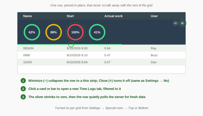
All eight are per-grid settings, not something everyone on your team is forced to see — turn on the ones that help your workflow and leave the rest off.
Turning One On
Every one of these rows is controlled from the same place: the grid's Settings panel, under a category named Special rows. Each row has its own setting with three choices — No, Top, or Bottom — so you can pin it above the column headers, below the last row, or leave it off entirely.
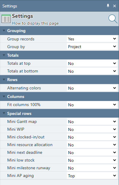
- Open the grid you want to add it to — Project Tasks for Gantt Mini-Map or Team Capacity, Time Logs for Mini WIP or Clocked In/Out, Project Tasks again for Next Deadline, Inventory for Low Stock, Project Tasks once more for Milestone Runway, Invoices for AP Aging.
- Open the Settings panel for that grid.
- Find Special rows in the list, and set the row you want (Mini Gantt map, Mini WIP, Mini clocked-in/out, Mini resource allocation, Mini next deadline, Mini low stock, Mini milestone runway, or Mini AP aging) to Top or Bottom.
- The row appears immediately, in place, without reloading the grid.
Gantt Mini-Map only draws its bars once the grid's own Gantt column is inserted — with no Gantt column present it shows a short reminder instead. Team Capacity needs the grid filtered down to between one and five projects to compute anything; filtered to zero or too many projects, it shows guidance text telling you to narrow the filter, rather than disappearing outright. Next Deadline, Low Stock, and Milestone Runway each show a short "all clear" message when there is nothing to report. AP Aging only appears for people who have the right to see client costs and amounts — the same right that controls the Invoices grid's own money columns. Like the other rows, they only appear on a normal grid view, not on a one-off list opened from a click-through.
Clocked In/Out — Who's on the Clock Right Now
Also on the Time Logs grid, the Clocked In/Out row is a live floor roster: one card per employee, showing their name and — for anyone currently clocked in — hours elapsed since they started (updating live, once a second, with no server call needed for the ticking number itself) and which project or task they're on.
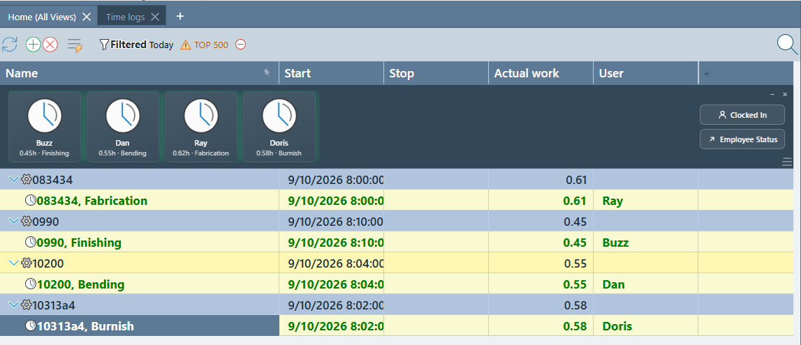
Clicking a clocked-in card opens a new Time Logs tab filtered to that person's currently running timer; clicking a clocked-out card filters to that person only, since there's no running timer to jump to. The underlying list refreshes from the server about every five minutes, same as Mini WIP.
Mini WIP — Shop Floor Progress at a Glance
On the Time Logs grid, the Mini WIP row shows one progress ring per open job matching the grid's current date filter: percent complete, total hours logged, the last task scanned against it, and a small green dot while a timer is actively running on it. Ring color follows the same green/yellow/red convention as the full Work In Progress grid — under 75% green, 75–99% yellow, 100% or more red.
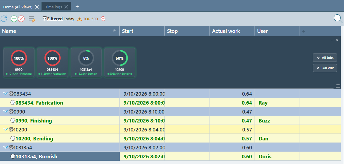
A toggle button cycles the row through All Jobs, Running (only jobs with an active timer), and Idle (only jobs with none) — a per-viewer preference remembered in your own browser, not something that changes what anyone else sees. A Full WIP button opens the complete Work In Progress grid. Clicking any ring opens a new Time Logs tab filtered to that job, carrying forward whatever date range the grid was already filtered to.
Gantt Mini-Map — Pan the Whole Project at a Glance
On the Project Tasks grid, once a Gantt column is inserted, the Gantt Mini-Map row draws a compressed strip of every task's bar — one thin bar per row, lined up top-to-bottom to match the grid beneath it, colored the same as the real Gantt bars. A vertical line marks today's date. A highlighted rectangle shows exactly which slice of that full project timeline your real Gantt column is currently scrolled to.
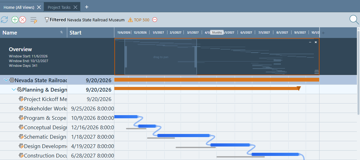
The rectangle is interactive three different ways:
- Drag it to pan the real Gantt chart to a different part of the timeline.
- Drag either edge to zoom the real Gantt chart in or out — the left edge moves the window's start date, the right edge changes how many days are visible.
- Click the row, then use the arrow keys to nudge the window left or right; hold Shift for a bigger jump. Holding a key down repeats the nudge automatically.
Unlike the other rows, Gantt Mini-Map never makes its own server request — it redraws instantly from the same task data already loaded into the grid, so panning and zooming feel immediate.
Team Capacity — Resource Allocation, Pinned
Team Capacity is a compact version of the full Resource Allocation chart, scoped to whatever one to five projects your grid is currently filtered to. Each bar represents one time period and is colored the same green/yellow/red/gray language as the full chart, so a shop-floor viewer reads it the same way either place.
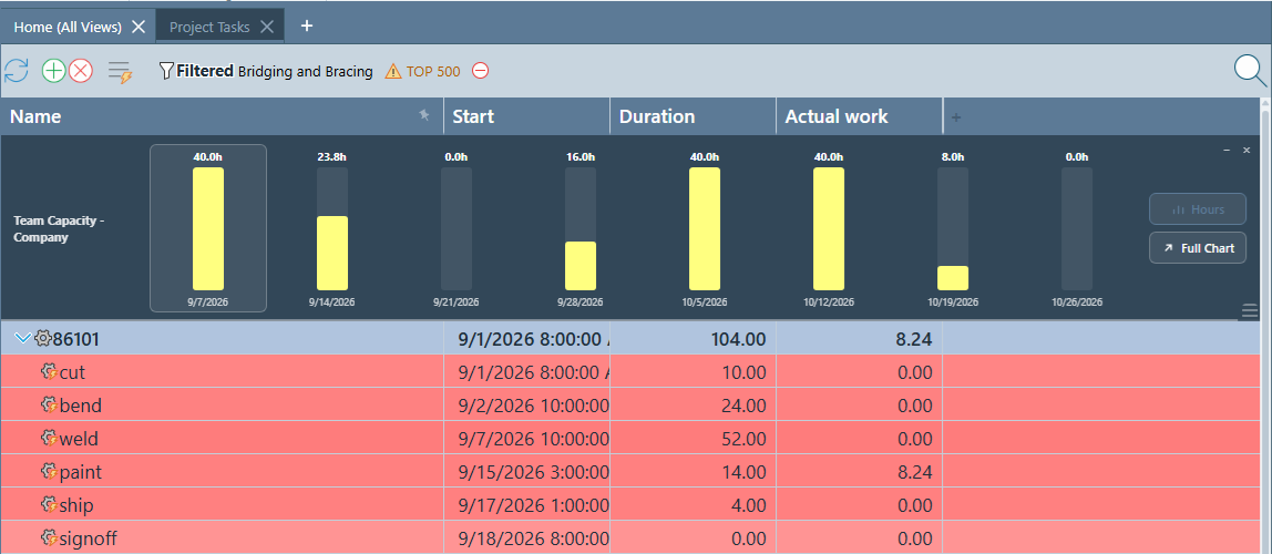
Click a bar for a toast showing its record count and total allocated hours; double-click it to open the underlying project tasks in their own grid — the same click and double-click behavior the full Resource Allocation chart's own bars already have. This row polls the server the least often of the rows that refresh on a timer, about every ten minutes, since its underlying calculation is the heaviest of the group.
Next Deadline — The Next 48 Hours, Pinned
On the Project Tasks grid, the Next Deadline row (labeled NEXT 48 HRS down its left edge) answers "what's due soon?" without a trip to a calendar. It shows one card per unfinished task whose due date falls within the next 48 hours, plus any task that went overdue within the last two weeks, so a slipped task doesn't quietly vanish. Overdue tasks come first, oldest first, followed by upcoming tasks, soonest first. Summary rows that only roll up other tasks are left out, and the row honors whatever filters the grid already has.
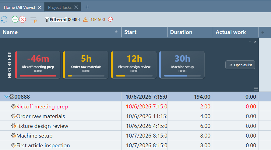
Each card is color-coded by urgency:
- Red — past its due time. The bar is solid.
- Amber — due within the next 24 hours.
- Blue — due in more than 24 hours. The bar starts full at 48 hours out and drains as the deadline approaches.
The countdown recalculates every minute right on your screen — no server call — so a card turns amber or red on its own as time passes. The list of tasks itself is re-checked about every five minutes, picking up tasks that were completed, rescheduled, or newly added. Click a card to jump to that task in the grid and select it; if the task is hidden inside a collapsed group, or isn't in the grid, it opens in its own one-task tab instead. Open as list opens every task on the row in a single grid.
Low Stock — Reorder Radar
On the Inventory grid, the Low Stock row shows every active item whose quantity in stock has fallen to or below its reorder level — the same "time to reorder" rule the inventory records themselves use. Items with no reorder level set are ignored. Cards are sorted most-depleted first, measured against each item's own reorder level rather than raw quantity, so a nearly empty box of screws ranks ahead of a pallet that is merely a little under its mark.
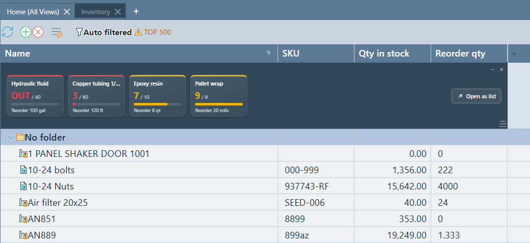
Severity is color-coded:
- Red, "OUT" — none in stock.
- Red — half of the reorder level or less.
- Amber — above half, up to the reorder level.
Hover a card for the full picture: item name, status, SKU, quantity in stock, reorder level, and reorder quantity. Click a card to find that item in the grid; if it's hidden in a collapsed folder, it opens in its own tab. Open as list opens every low item in one grid, ready to review or print. Because barcode scans deduct stock all day long, the row re-checks about every five minutes. If the check can't be completed, the row says Stock check unavailable rather than claiming everything is stocked, and when nothing is low it reads Everything is stocked.
Milestone Runway — Every Upcoming Milestone on One Timeline
On the Project Tasks grid, the Milestone Runway row (labeled MILESTONES down its left edge) lays your milestones out along a single horizontal timeline, so you can see how they are spaced without opening a Gantt chart. A milestone here is a task with zero duration that is not finished and is not a summary row. The row honors whatever filters the grid already has, so filtering to one project shows just that project's milestones.
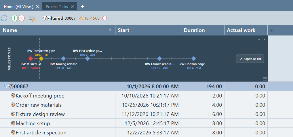
Each diamond sits at its true position on the timeline, with a label showing the milestone's name, its date, and how far away it is (for example "Oct 14 – 12d", or "Oct 1 – 5d late"). Weekly tick marks run along the line. The timeline reaches back up to 30 days for missed milestones and forward up to 90 days, and it zooms to fit — if nothing is due soon, the right edge pulls in to about two weeks; if a milestone is months out, it stretches to include it.
- Red — missed. The date has already passed, and the left side of the line is tinted red.
- Amber — due today or within the next 7 days.
- Blue — more than 7 days away.
When milestones are close together, their labels move above and below the line so they never overlap. The row shows up to 10 missed and 40 upcoming milestones. If so many are bunched together that labels can't be kept apart, the row switches to compact chips and, in extreme cases, a single line of text (see How These Rows Handle Crowding). Click a milestone to select it in the grid; if it is hidden inside a collapsed group or isn't in the grid, it opens in its own one-task tab instead. Open as list opens every milestone on the row in one grid. The colors and "days away" labels update on their own each minute, and the list itself is re-checked about every five minutes.
AP Aging — What You Owe, and How Late It Is
On the Invoices grid, the AP Aging row (labeled AP AGING down its left edge) answers "how much do we owe, and how overdue is it?" at a glance. It totals every unpaid invoice that still has a balance due, then splits that total into four age groups based on how many days past its due date each invoice is. The row honors whatever filters the grid already has, so filtering to one vendor shows that vendor's aging alone.
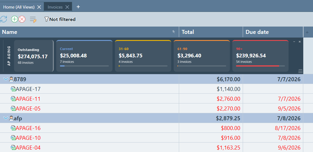
The four age groups are:
- Current (blue) — not yet due, no due date entered, or up to 30 days past due.
- 31–60 (yellow) — 31 to 60 days past due.
- 61–90 (orange) — 61 to 90 days past due.
- 90+ (red) — more than 90 days past due.
Hover a card for a plain-language summary. Click any card — or the Outstanding block — to open the invoices behind that number in their own tab, using the same filters as the card so the list always adds up to the figure you clicked. A card with no invoices is dimmed and not clickable. Very large groups open the 500 oldest-due invoices.
Unlike most of the other rows, AP Aging has no timer. It is recalculated each time the grid is loaded or refreshed. If the totals can't be calculated, the row says AP aging unavailable rather than showing zeros that look like good news. It is only shown to people with the right to view client costs and amounts.
How These Rows Handle Crowding
Mini WIP, Clocked In/Out, Next Deadline, Low Stock, Milestone Runway, and AP Aging can end up needing to show anywhere from one job, employee, task, item, or milestone to well over a hundred, in a pinned row that has no scrollbar of its own. Rather than let a card get cut off mid-edge or force the row to grow without bound, each one automatically picks the densest layout that still fits: full cards, rings, or a positioned timeline when there's room, small wrapping chips (name and a short status only) once there are more items than fit in one row, and — in extreme cases — a single scrolling line of plain text, clipped at the edge like a stock ticker rather than broken mid-card.
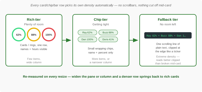
AP Aging always has exactly five blocks, so it only changes layout in a very narrow pane. Team Capacity and Gantt Mini-Map don't need this — Team Capacity always shows a fixed, small number of bars for the periods in view, and Gantt Mini-Map's compressed bars simply get thinner as more tasks are loaded rather than needing a separate layout at all.
Minimize, Restore, and Close
Every one of these rows carries the same small cluster of controls in its corner:
- Minimize (−) — collapses the row to a thin strip without turning it off, useful when you just need the grid rows below it for a moment. Your choice is remembered in your browser, so it stays minimized the next time you open that grid.
- Restore — a small square icon that appears once minimized, bringing the row back to its previous height.
- Close (×) — turns the row off completely, the same as setting it back to No in the grid's Settings panel. Turn it back on the same way you turned it on.
Every row also remembers a height you drag-resize it to, and Gantt Mini-Map defaults noticeably taller than the others (about four times a normal row) to leave enough vertical room for its compressed bars to read clearly.
How This Differs From Totals at Top/Bottom (and Every Other Special Row)
"Special rows" is a broader family in Standard Time® than just the eight covered on this page. Most of the others are simple, static summary rows — they show a fixed number, recalculated only when the grid's filter changes, with no polling, no toggle, and nothing to click through. The eight on this page are a different, richer kind: small live dashboards that refresh themselves on a timer, offer a mode toggle or button, and open filtered detail when you click into them.
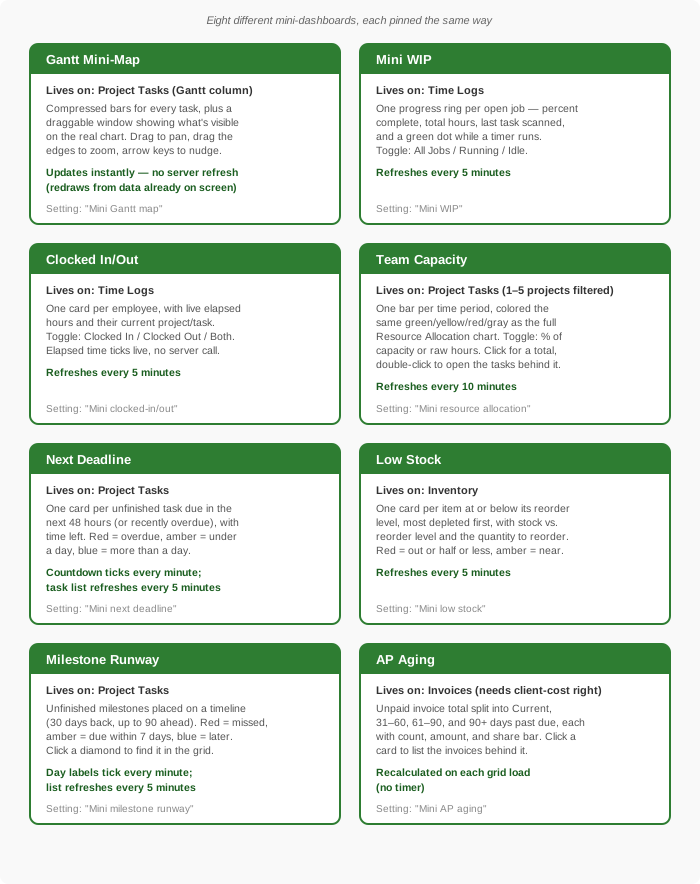
For curiosity's sake, here's the full family of special rows a Standard Time® grid can pin, simple and interactive alike:
| Special row | Kind | What it does |
|---|---|---|
| Totals at Top / Bottom | Static | Sums (or otherwise totals) the numeric columns currently visible in the grid. Available on virtually any grid. Recalculates when the grid's data or filter changes — nothing to click, nothing polling in the background. |
| Scheduled Totals at Top / Bottom | Static | Timesheet-only. Totals each person's scheduled hours for the period shown, for comparison against what was actually logged. |
| Exceeds Schedule at Top / Bottom | Static | Timesheet-only. Totals the amount by which logged hours ran over what was scheduled for the period. |
| Overtime Totals at Top / Bottom | Static | Timesheet-only. Totals overtime hours for the period shown. |
| Gantt Mini-Map | Live & interactive | Compressed full-project Gantt overview with a drag-to-pan, drag-to-zoom viewport window. See above. |
| Mini WIP | Live & interactive | Shop floor progress rings per open job, with a Running/Idle/All toggle and click-through to filtered time logs. See above. |
| Clocked In/Out | Live & interactive | A live floor roster of who's clocked in, with elapsed hours and click-through to their timer. See above. |
| Team Capacity | Live & interactive | A compact color-coded allocation bar strip for the filtered project(s), with a Percent/Hours toggle and click-through to the underlying tasks. See above. |
| Next Deadline | Live & interactive | Task cards for everything due in the next 48 hours plus recent overdue work, color-coded red/amber/blue with a live countdown and click-through to the task. See above. |
| Low Stock | Live & interactive | Inventory items at or below their reorder level, most depleted first, with stock vs. reorder level and click-through to the item. See above. |
| Milestone Runway | Live & interactive | A timeline of unfinished milestones, with missed ones in red and ones due within a week in amber, plus click-through to the task. See above. |
| AP Aging | Live & interactive | Unpaid invoice totals split into Current, 31–60, 61–90, and 90+ days past due, with click-through to the invoices in each group. See above. |
In short: reach for Totals (and its Timesheet-only cousins) when you just need a number pinned in view. Reach for one of the eight rows on this page when you want an actual, clickable status board — shop floor progress, who's on the clock, the schedule at a glance, team capacity, what's due next, what needs reordering, where your milestones fall, or how overdue your bills are — without leaving the grid you're already working in.
- Gantt Chart Guide — the full chart the Gantt Mini-Map is a compressed view of
- Resource Allocation Guide — the full chart Team Capacity is a compact strip of
- Saving and Restoring Dock Layouts — save a workspace with your favorite frozen rows already turned on
- How to Use AI Chat — see the Gantt Mini-Map row pinned above a project's chart after an AI-applied schedule change
- FAQ: Project Management & Gantt Charts